Boost Your Engagement with Custom Fonts
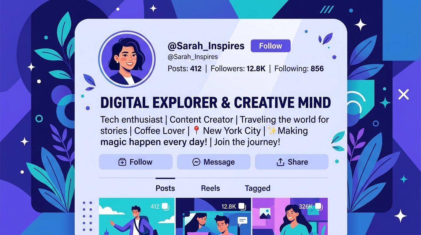
Every platform gives everyone the exact same default font. That sameness is part of why a post that looks even slightly different — a bolded headline, a stylized bio line — tends to catch the eye faster than one that blends into the feed around it. Understanding why that happens can help you use styled text more effectively, instead of just sprinkling it in randomly.
Why styled text catches attention
The human eye is drawn to contrast and pattern breaks. In a feed made almost entirely of identical default-font text, anything visually different — heavier weight, unusual shape, different spacing — automatically stands out, simply because it doesn't match the surrounding pattern. This is the same principle that makes a single bolded word in a paragraph draw the eye first.
That's not a design theory, it's just how attention works on a scroll — and it's why accounts that use styled text strategically tend to see stronger stops and longer read-throughs on their opening lines.
How to actually add styled text
Most platforms don't offer built-in custom fonts for captions or bios, which is why styled text online works differently than in a word processor. A bold text generator converts normal typed text into bold-styled Unicode characters that paste directly into any caption, comment, or bio field and render as bold everywhere — no app, download, or special permissions required.
This works because the "font" isn't actually a font file — it's a different set of Unicode characters that visually resemble bold letters. The platform doesn't need to support custom fonts at all; it just needs to support Unicode, which nearly every platform already does.
🎯 Where to use it for the biggest impact:
- Bio headlines: The first line of a bio is prime real estate — bolding your name or tagline makes it the first thing a new visitor's eye catches.
- Caption hooks: Bold the opening sentence of a caption, since that's often the only part visible before a "see more" cutoff.
- Highlighted CTAs: A bolded call-to-action line ("Link in bio," "Shop now") stands out against surrounding plain text.
- Section breaks in long posts: On LinkedIn or Threads, bolding mini-headers inside a long post helps readers scan instead of bail.
⚡ Keep it selective
The instinct once you find a formatting trick that works is to use it everywhere — but styled text loses its power the moment everything is styled. If an entire caption is bold, nothing in it stands out anymore; the contrast that made it effective in the first place disappears. The strongest results come from styling just the one line that needs to be seen first, and leaving the rest in plain text.
It's also worth testing on both iOS and Android before relying on it heavily, since Unicode-styled text can render slightly differently depending on the device and the platform's supported character set.